For project inquiries and more information about our studio, please complete our inquiry form or book a discovery call.


RĒJINS is a San Francisco well-aging skincare brand made for maturing skin of every tone, with a particular focus on melanin-rich skin. Having outgrown its original branding as the range expanded beyond a single product, the founder came to us for a rebrand that felt timeless, grown-up and rooted in heritage, across visual identity, packaging and web.
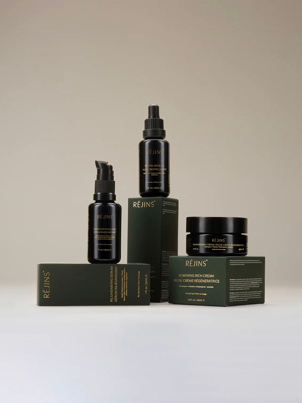
At the center of the identity is the signature color Kombu, inspired by the landscapes of Southeast Asia. The palette deliberately moves the brand away from colors common in sustainable skincare and toward those of established heritage beauty houses. A classic serif typeface and image direction centered on mature, melanin-rich skin complete the identity.
Rejins
2025
Visual Identity, Brand Strategy, Packaging, Website Design
Photography Credit: Rejins


Website Experience
An understated site built to bring customers into the world of RĒJINS. The layout is minimal and focused, leading with ritual and ingredient stories, from sea buckthorn to plant stem cells, before introducing the products. Editorial imagery of mature skin, generous white space and the Kombu green palette carry the identity online, while a journal and dedicated spa and retail partner pages support the brand’s wholesale growth.

Packaging
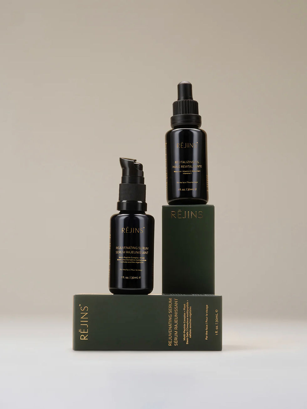
Designed with the unboxing experience in mind, the packaging carries Kombu green across the full range, with embossed texture and gold foil finishing. The system is built to scale as the line grows and moves onto spa shelves, keeping each new product recognizable while adding a tactile detail customers remember.
